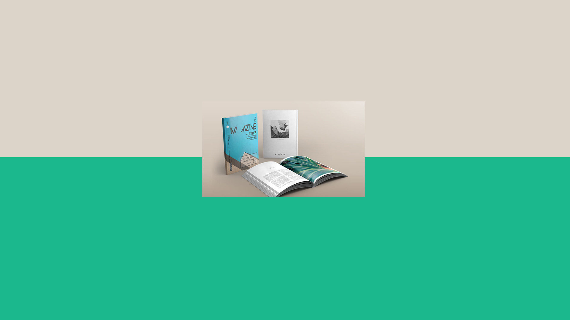
How to make a magazine: design tips and tricks
The magazine is hardly a new format, but it is one that is often overlooked. Much has changed over the years, and the possibilities of magazines are endless. Once considered a sacred format, the magazine format has evolved from just something to buy on newsstands to something you can create yourself. Compact, lightweight, and low-cost, some professionals are even leveraging the magazine format as a portable way to create a portfolio of their work.
Benefits of a magazine format
1. Magazines are less formal
I can’t imagine someone taking their prized, hardcover, first-edition book to the pool while on vacation, but I can surely see that same person taking a stack of magazines. A magazine is entirely consumable. Read, then pass it along to someone else.
2. Magazines are printed on a schedule
Weekly, monthly, or even quarterly: By creating a magazine, you imply to your audience a series is coming. This is a great way to keep loyal readers engaged in your content and to keep them coming back for more.
3. They’re inherently collaborative
Each issue uses multiple writers, photographers, and editors to complete it. So, creating a magazine is a great way to network and collaborate with your fellow creatives.
4. You can print inside the covers
Blurb’s magazine format has the option of printing images and text on the inside of the front and back cover. This is a nice design addition that is exclusive to this print format.
5. They’re cost effective
Blurb’s magazines are one of the most cost-effective formats for any project. Premium magazines have a high-end magazine finish with a heavier cover. Economy magazines have a lighter weight and lower print fidelity for a lower cost. But no matter how you print them, they’re cents to the dollar on photo books!
Tips to remember when making a magazine
Make sure your page counts are divisible by four
You can always add blank sheets at the end to make your own magazine fit this page count. But don’t worry—if you use Blurb’s software to design your magazine, it will let you know if your magazine’s page count is incorrect.
Forget the spine text
Even with a large page count, a magazine’s spine is relatively small. We suggest using an image, solid color, or texture on the spine instead of text.
Don’t skimp on your cover
As they say, you only have one shot to make a great first impression. When you’re designing your magazine, make sure your cover is compelling by using high-impact photography and a professional header. A good rule of thumb is to use one main headline, and fewer than five sub-headlines to ensure a clean design layout. Browse your local bookstore’s magazine section and take note of the covers that stand out to you.
Think in spreads, not pages
Readers absorb magazines across two pages, so don’t be afraid to design across the spread. But don’t forget to give plenty of white space around your content, especially in the gutter. We suggest using at least 1/4 to 1/2 inch of a page margin from the edge—or even more.
Typography is especially important in designing magazines
Photos and color can and will change with each issue, but typography will remain a constant. Take the time to consider the personality you want your magazine to have. For example, serif fonts have an upscale feel, while sans-serif fonts imply modern and youthful content. Learn more about typography.
Time to design your own magazine
With dedication and attention to detail, magazines can inform, inspire, and celebrate the art of visual communication in an ever-evolving publishing world. Bring your ideas to life and make a magazine today with Blurb.


This post doesn't have any comment. Be the first one!