

How to calibrate your monitor for photo editing
Have you ever noticed that the colors on your monitor look different from those in a printed photo or book? This discrepancy can be upsetting, especially when you’ve spent dozens of hours editing your images. Calibration is the secret ingredient that aligns what you see on-screen with the final product—whether it’s a digital file or a page in a photo book.
In photography and graphic design, color accuracy isn’t just about aesthetics. It’s crucial for conveying the right mood and message of your work. This precision ensures consistency—super important for professionals who rely on printed works like books, portfolios, and photographs. When colors shift unexpectedly between devices or during printing, all your meticulous edits are futile!
Calibrating your monitor might sound technical (and truthfully, there are some intricacies), but think of it as tuning an instrument before a concert. Like slightly out-of-tune instruments dramatically affect music quality, uncalibrated screens lead to visual disharmony. We’re here to help simplify the process.
What is monitor calibration, and why is it important?
Monitor calibration is fine-tuning your display’s settings to show colors, brightness, and contrast as accurately as possible. For anyone involved in photo editing or graphic design, this is a crucial step to ensure that what you see on-screen translates faithfully to other mediums—another monitor or a printed page.
- Color accuracy: This ensures the hues you pick match industry standards (like sRGB or Adobe RGB), which means no unexpected color shifts when printing.
- Brightness: Adjusting this helps maintain detail in highlights and shadows. Too bright, and you lose nuance. Too dim, and everything melds into shadow.
- Contrast: A proper contrast setting preserves details across the spectrum—from deep blacks to vibrant whites—without flattening your image’s dynamic range.
- Color profiles: These are like translators between different devices. They describe how colors should appear on different screens or printers so that an image looks consistent everywhere.
When preparing images for print specifically, these elements are even more critical. Printed products typically offer less leeway than digital displays because once ink hits paper, there’s no going back. Calibrated monitors ensure adjustments made during editing translate correctly from screen to page without unpleasant surprises in color fidelity or tonal ranges.
Monitor calibration tools for the job
When calibrating your monitor, the tools you use can make a significant difference in achieving accurate results. A range of hardware and software options are available for different needs and budgets.
- Colorimeters: The Datacolor SpyderX Pro offers an affordable yet effective solution, using its sensor to read color values from your screen and adjust them according to standard color spaces. For a higher-end option, professionals revere X-Rite’s i1Publish Pro 3 Plus toolkit for its advanced capabilities.
- Spectrophotometers: While generally pricier than colorimeters, X-Rite provides a wide range of options for photographers needing precise control over printer profiles and display calibration.
- Software solutions: For those looking beyond built-in operating system utilities, DisplayCAL is an open-source tool that works with various color sensors and provides detailed customization options. For more advanced features, check out X-Rite’s i1 software.
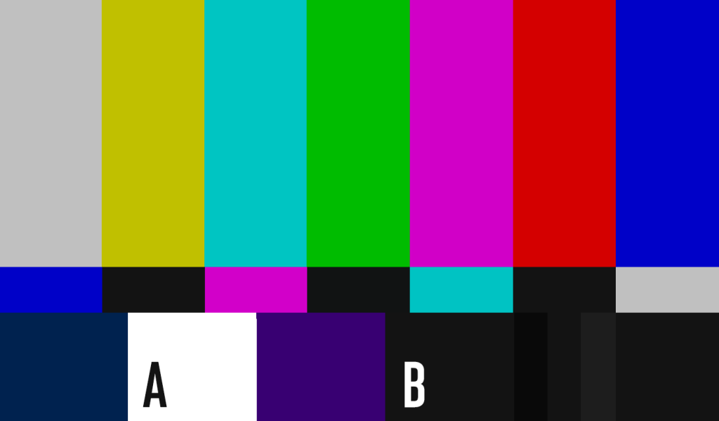
Individuals without access to professional calibration tools or just starting can use manual calibration methods. These involve using test images or built-in monitor controls alongside online guides or tutorials.
Though not as precise as hardware calibrators, these manual techniques can provide noticeable improvements over default settings and help develop an eye for detail, invaluable for all aspects of digital image work.
Steps to calibrate your monitor effectively
Now, let’s get into the actual steps. If you’re more of a visual learner, this video from Jared Platt provides an overview of the process we describe in detail below.
1. Preliminary setup and using the calibration software
Before you start calibrating, take control of your editing environment. The ambient light in your room can drastically affect how colors appear on-screen. Aim for moderate lighting that’s neither too bright nor too dark. Think about the typical conditions under which somebody will view the final printed work and try to replicate them as closely as possible.
Consider these factors.
- Ambient lighting: Use dimmable lights to adjust brightness levels or blackout curtains to manage natural light.
- Workspace conditions: Mimic lighting conditions anticipated at galleries or where you might showcase your work, calibrating under stronger lights if a gallery is well-lit or softer for home settings.
- Print preparation: Soft proofing features in calibration software allow you to preview images with different finishes, like glossy or matte paper. This will help you make informed adjustments before printing.
After setting up your workspace, install the monitor calibration software that came with your colorimeter or spectrophotometer device or from a reputable third-party provider.
A note on monitors
Your monitor is another important component to consider. For photo editing and print work, opt for IPS panels over TN for their superior color accuracy, consistency across various angles, and ability to reproduce broader color gamuts.
What are we talking about? IPS (In-Plane Switching) panels and TN (Twisted Nematic) panels are two types of technologies used in LCD (Liquid Crystal Display) screens. IPS panels offer better color accuracy, wider viewing angles, and can reproduce a broader spectrum of colors—making them ideal for tasks that require precise color representation like photo editing. TN panels are cheaper and have faster response times, which are great for gaming. Photogs, stick with IPS panels!
2. Configure your calibration settings
Configuring the foundational settings of your monitor is key to a successful calibration. Here are the settings and our suggestions.
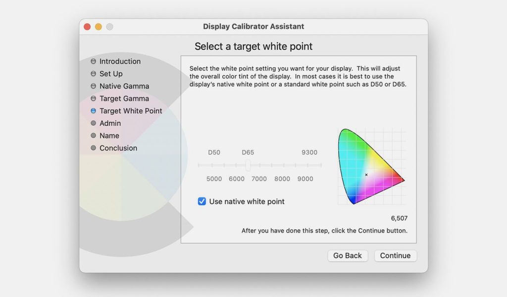
- White point: This determines your display’s color temperature, affecting how warm or cool colors appear. A common standard for print work is D50 (5000K), which emulates midday light and is consistent with gallery standards. For general editing where lighting conditions vary, D65 (6500K) often serves as a neutral baseline.
- Luminance: Brightness levels should reflect your typical working environment and final product. For image viewing primarily on monitors, aim for higher luminance, whereas lower brightness mimics paper in printed form—usually between 80 to 120 cd/m²—but always consider your specific ambient light conditions.
- Gamma value: The gamma setting affects mid-tone brightness. A gamma value that is too high results in washed-out images, too low, and they lose detail in shadows. Most operating systems and environments use a default gamma value of 2.2, balancing contrast across diverse viewing scenarios.
Integrating color spaces into this process ensures consistency from capture through editing to final output.
- sRGB offers a solid standard for web-based imagery.
- Adobe RGB encompasses a wider gamut suitable for high-quality prints.
Choosing the appropriate profile sets the stage for accurate translation of your editing across different devices and media types.
3. Start the calibration process
The calibration process is a dance between your hardware and software, each step requiring attention to detail.
- Calibrate your device: In some cases, before you adjust your monitor, you should calibrate the calibration device itself. This “pre-calibration” ensures its sensors are accurate and can measure colors correctly.
- Device placement: Carefully attach or place the colorimeter against your screen as directed by its instructions. Ensure it sits flush against the display for consistent readings without ambient light interference.
As you make adjustments, choose between manual or automatic control within the calibration software—automatic is generally easier but may not allow for fine-tuning.
If opting to adjust the display settings manually, gradually tweak brightness, contrast, and RGB gains as prompted by the software until they align with recommended values.
For those using photo editing suites like Adobe Photoshop or Lightroom to improve photo quality, check that the internal color management settings match those set during hardware calibration. Any inconsistencies here could lead to misleading visual information while editing.
Remember that software controls within these applications might override system-level settings unless properly configured, making verifying post-calibration accuracy critical in these environments. A well-calibrated monitor works hand-in-hand with well-configured software, ensuring what you edit translates accurately everywhere.
4. Fine-tune your monitor settings
After the initial calibration run, you may need to make finer adjustments to dial in perfect color accuracy.
- Adjust RGB values as needed: Depending on your monitor’s capabilities and the software’s guidance, you might have to adjust the Red, Green, and Blue values manually. This adjustment is typically necessary when colors appear tinted or washed out after the first calibration pass.
- When fine-tuning: Incrementally alter RGB sliders (if available) following calibration software prompts until no color cast remains.
- For brightness levels: Refine levels according to visual cues provided by the software. For example, you would make this adjustment to achieve a specific luminance value you set in step two.
Most modern calibration tools offer real-time feedback via software indicators that guide you toward optimal settings with clear targets for each parameter you adjust. Be patient, as minor changes can significantly impact overall image quality. The goal here is precision, so give yourself time to get it just right.
5. Finalize the calibration process
This is where you let technology take over to finalize your efforts. The calibration software will now perform an extensive color analysis, comparing a wide array of colors on your monitor with known standards.
Once this step concludes, carefully remove the calibration device from your screen, ensuring you do not disturb any settings or buttons that may alter display properties.
Now is the time for a review. Examine before-and-after results using color swatches typically provided by the calibration program. This visual comparison allows you to appreciate the adjustments and ensures satisfaction with your monitor’s newly calibrated state.
To preserve these new settings, save them as a named color profile. Be descriptive to easily identify them later (e.g., “PhotoEdit_Jan2024”).
Lastly, consider setting a reminder for future recalibrations. How often you recalibrate depends on usage; every one to two months is a common practice among professionals who rely heavily on accurate color reproduction in their work.
6. Review calibration results
With the calibration process complete, it’s crucial to evaluate its impact. Take a close look at how the calibrated settings affect color representation on your monitor. Colors should now appear more natural and true-to-life, without any dominant hue skewing the balance.
Consider making side-by-side comparisons. If possible, compare pre-calibrated versus post-calibrated images using test pictures that include a wide range of colors and tones. Notice how shadows, mid-tones, and highlights differ with the new profile.
Regularly reviewing these results will likely reinforce the importance of maintaining an accurately calibrated display for professional work. You’ll find routine calibrations equal creative that meets expectations every time—from screen to print.
Why regular monitor calibration is a must
Regular monitor calibration is essential to ensure every color step and tonal gesture aligns with your creative vision. It’s a practice that separates professionals from amateurs and showcases an attention to detail that clients notice and respect.
To maintain this level of professionalism, integrate calibration into your workflow as a routine maintenance task, just like you would regularly service high-end equipment.
Knowing when to recalibrate isn’t always clear-cut, but there are several indicators.
- Colors begin to look off, or prints no longer match their digital counterparts, a sign that it’s time for another session.
- After any significant hardware or software updates that can alter display characteristics without warning.
- If you frequently work in critical color management situations—or if environmental lighting conditions change substantially—it’s wise to recalibrate more often.
The takeaway here? Regularly calibrated monitors ensure reliability and consistency within all phases of photo editing—from first click-through to final print. By committing to these practices, you safeguard the quality of your work and reinforce trust with clients and collaborators alike, cementing yourself as an artist and a professional.
***
Blurb is a self-publishing company by and for creators. We believe in helping photographers and artists of all kinds showcase their work with confidence. To learn more about self-publishing your work, visit Blurb’s website. Keep creating and pushing the boundaries of your art!