How to choose the best font for print books
There is a subtle art of choosing the best font for your book. You must consider your book’s readability, legibility, genre, and tone—and those are just a few of the fundamentals that inform your chosen typeface.
But with hundreds of available font families and typefaces, selecting the ideal fonts for your printed book can feel daunting. It’s a decision that can either illuminate or clutter your words. The key is a simple and minimal approach, as less is often more when making your book look (and read) fantastic.
Before we delve into the art and science of font selection, let’s first cover some basic principles of typography for print books.

The impact of typography in print books
Typography, the art and technique of arranging type, is an essential element that breathes life into the pages of your print book. It’s not merely about making words visible but crafting an immersive reader experience.
Good typography enhances legibility—the ease with which one can distinguish letters and words—and readability, which dictates how effortlessly sentences flow together. The visual appeal of typography is essential because it sets the mood before the reader takes in the first word.
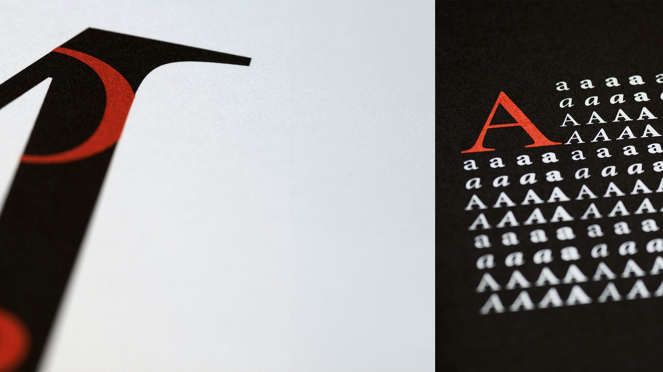
Consider Jane Powers’ Fruitful: A Book of Unabashedly Fruity Cocktails shown above. The cover features a bold and nostalgic typography that sets a fun and uplifting mood for the book’s theme. Take a few modern cookbooks off your bookshelf and see how many use whimsical fonts to mirror culinary creativity.
What’s the difference between “typefaces” and “fonts?”
Diving deeper into this typographic journey reveals a crucial distinction: “typeface” versus “font.” A typeface is a family of designs like Garamond or Helvetica, with consistent aesthetic qualities shared across different weights or styles within their groups.
In contrast, a font specifies attributes such as size and weight within that family. For instance, 12-point bold Helvetica and 10-point italic Helvetica are distinct fonts under the same umbrella typeface. This differentiation might seem nuanced but think about siblings with common features yet unique personalities. That’s what separates Arial Bold from Arial Narrow—it’s all in their individual characteristics.
History of typography and typefaces
Western culture’s connection to fonts goes back to the invention of moveable type by Joannes Gutenberg. The first font was called “Blackletter,” made to resemble the work of 15th-century scribes. Over the centuries that followed, we accumulated hundreds of fonts, inheriting an extensive catalog of classics we continue to use today.
Later, in the mid-1900s, more modern typefaces appeared all over Europe, and contemporary ones like Helvetica and Futura became among the recent favorites. These modern typefaces are known as “sans-serif,” which means the endpoints of the letters are missing the flags and pedestals that older typefaces used.
The invention of personal computers had two effects on typography. First, the original digital screens couldn’t render serifs clearly, so even as monitors became clearer and more powerful, sans-serif typeface became the convention for digital work. Second, personal computers allowed the ordinary person to wield various typefaces to add mood and extra meaning to the written word.
Today, sans-serif fonts like Helvetica, Arial, and Futura are commonly used in design and digital work. At the same time, typefaces like Garamond, Times New Roman, and Century have serifs that guide the eye along printed pages. In modern works, serif typefaces are used for text-heavy print with an air of formality.
Practices for procuring complementary fonts for your book
Selecting the perfect fonts for your print book is both a creative expression and an exercise in logic. Each choice can enhance or detract from the reader’s experience, so let’s explore some typography best practices to ensure your literary work is as palatable as possible.

Prioritize readability and legibility
The comfort with which readers absorb text over extended periods hinges on readability—a fusion of visual ease and distinct letter differentiation. Serif fonts like Palatino, Georgia, and Times New Roman reign supreme in body text due to their serifs—the small strokes that guide the eye fluidly from one character to another, creating cohesive lines that facilitate swift navigation through dense paragraphs.
In contrast, sans-serif fonts such as Helvetica may induce strain when used excessively in body copy. Reserve them for headings where brevity rules. Mindfully choosing fonts that prioritize readability and legibility, especially within large blocks of text, elevate the reading experience while respecting your audience’s visual journey through each page.
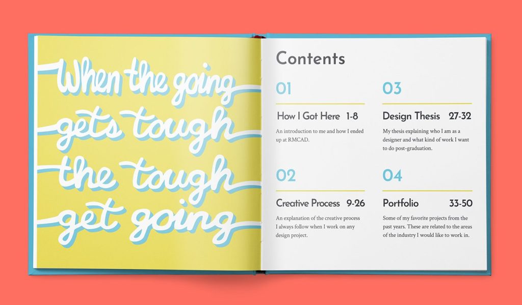
Solace, Shundiin D. Nakai’s unconventional take on a creative portfolio book, uses a potent combination of fonts to effectively structure text in an easily readable and powerful way.
Be “on brand” with content and style
The font you choose for your book is a silent yet powerful communicator. Your typeface selection must align harmoniously with your book’s message and “brand,” whether it’s weaving stories of mystery, romance, inspiration, or business leadership.
When selecting typefaces, consider them an extension of your literary voice. They should mirror the mood you intend to convey without overshadowing the content. A well-chosen font resonates subliminally with readers. When your font seamlessly embodies the spirit of your work, your readers get immersed in an effortless flow.
Conversely, mismatched typography can disengage or distract—a crime story set in playful Comic Sans might inadvertently dampen the intensity rather than ignite it. Just as brands meticulously craft their visual advertisements to resonate with target audiences, so must creators carefully choose typography to ensure their words carry forth their intended emotional and thematic payloads.
Use genre-appropriate fonts
Typography carries the genre’s soul, with each style evoking distinct emotions and expectations from readers.
- Comic books often employ fonts like Comic Sans or BadaBoom that reflect their lively, expressive content through playful strokes reminiscent of hand-drawn letters.
- Photography and art books typically use minimalist sans-serif fonts such as Helvetica or Futura, complementing visual works without competing for attention.
- Zines embrace more eclectic typography to mirror their independent spirit; a font like Courier New can channel a raw, typewritten vibe.
- Novels typically find solace in classic serifs—think Garamond or Caslon—which provide a seamless reading flow essential for long-form storytelling.
Each genre finds its voice in fonts that best tell its story. Where this speaks the most volumes is your book’s cover.

Make a statement with the right book cover font
Choosing the best font for your book cover is pivotal in grabbing readers and conveying the mood and theme of your book. Here are some best practices for selecting the right book cover font.
- Consider the genre and topic. Different genres and topics call for different font styles. Make sure your chosen font aligns with your book’s theme and tone.
- Use color wisely. White is often the best cover text option if you overlay your font on an image. Avoid using black on a dark background, as it can be less readable.
- Keep it simple and avoid mixing too many font styles. If you don’t have experience in typography and book cover design, stick with one font family, either serif or sans-serif. Mixing different font styles can make your cover look cluttered and unprofessional.
- Test your font choices. Produce a few sample pages or cover designs using different fonts to see which works best. You can also use websites like MyFonts to test fonts before purchasing them.
- Consider recruiting professional assistance. If you’re unsure about font selection, seek help from a professional book designer or typographer. They can provide valuable insights into typography trends and best practices.
Don’t overlook the impact of font selection on your book’s cover. It’s integral to creating a visually appealing and readable book cover design that accurately reflects the content inside.
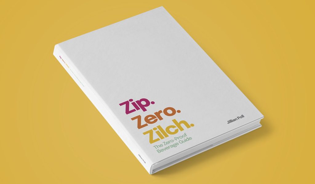
Jillian Poll’s Zip. Zero. Zilch. (shown above) uses a colorfully eye-catching and sophisticated modern font choice—a minimalist design book cover that’s on-brand with zero-proof beverage recipes.
Leverage platform-recommended fonts
Publishing platforms offer tailored recommendations to enhance your book’s presentation across diverse mediums, which can provide helpful insights for font selection.
- Blurb is a proponent of popular serif fonts like Courier, Palatino, and Times Roman, as well as sans serif fonts like Helvetica, Arial, and Geneva. Merriweather is another choice for presenting portfolios and academic texts.
- Amazon suggests readable body copy fonts like Centaur, Garamond, and Hightower Text, which are easy on the eyes for long passages.
- Ingram proposes tried-and-true options like Jenson, Minion, and Palatino Linotype while straying away from clichéd fonts like Comic Sans or Papyrus.
- Barnes & Noble recommends serif fonts, like Georgia and Palatino, to allow letters to stand out to readers. The book platform also suggests fonts like Garamond, Baskerville, Minion Pro, Cormorant, and Caslon.
While these are not hard and fast rules for your chosen self-publishing company, these platforms provide frequently curated lists of suggested typefaces aligned with industry standards. The goal is to pair a font consistent with your platform to meet technical requirements and subtly enhance reader engagement within each distribution channel.
Design with coherence and clarity
Maintaining design coherence is crucial when selecting the best font for your book. Start by selecting just a few fonts that serve distinct purposes within your book.
- Choose your body text font. Opt for high readability. When in doubt, consider using serifs.
- Select header and sub-header fonts. They should complement the body text while adding character.
- Consider special elements. Captions, quotes, or footnotes might need a subtler variant.
This simple trio approach ensures clarity without overwhelming readers with stylistic changes.
Empowering and Inspiring Women Part 2 (featured above) is a harmonious balance of typeface creativity and logic. The book uses handwritten-style fonts in select titles and headers, with more traditional typefaces for sub-headers and body text.
Utilize resources to find the right typeface
Exploring various resources like Google Fonts, Adobe Typekit, DaFont, and MyFonts offers many choices tailored to project needs. When perusing these libraries try the below.
- Filter searches based on genre-specific attributes (like Serif, Sans-serif).
- Test sample text in desired fonts to preview readability.
- Check compatibility across print/digital formats if applicable.
Decide between paid versus free fonts
The quest for the perfect font may lead to both paid and free options. Investing in a premium typeface often means access to a unique design, extensive character sets, and technical support—valuable assets for ensuring your book stands out.
Free fonts, like those from FontSpace, can be enticing with their no-cost appeal, but diligently scrutinize them for quality. Some may lack the finesse or full range of glyphs needed for professional publishing.
Navigate the legal terrain
Understanding copyright and licensing before using any font is crucial. In some cases, it’s not just about aesthetics but legality, too. Ensure you’re authorized to use your chosen typeface commercially by carefully reviewing its license agreement.
Some font-sourcing platforms require purchasing extended licenses, while others restrict usage types or distribution volumes. These are all vital details that bookmakers must heed when embarking on publication. Adhering strictly to legal guidelines protects intellectual property rights and solidifies professionalism in your creative endeavor.
Tips for selecting and perfecting book fonts
When actualizing your book’s character through visual presentation, typography is a subtle yet powerful ally. These actionable typography tips can guide you in selecting fonts that match the essence of your work and improve the overall reading experience.
- Reflect your book character. Choose fonts that echo the essence of your narrative. A thriller might benefit from sharp, angular typefaces, while romance could call for more fluid scripts. Consider what emotions you wish to evoke and select accordingly.
- Keep font family consistent. Stick with one or two font families throughout your book to maintain stylistic continuity. This establishes a consistent visual theme without distracting from content coherence.
- Pay attention to line spacing (leading). Proper line spacing prevents text crowding, enhancing readability. Aim for leading that is 120% to 145% of your font size to allow readers’ eyes a comfortable journey down the page.
- Prioritize accessibility in text size and style. Prioritize accessibility by selecting legible font sizes—typically 10 to 12 points for body text and at least 18 points for headlines. Steer clear of overly decorative fonts, which can hinder legibility, especially for those with visual impairments.
- Build in margins and white space. Sufficient margins and white space are not wasted areas—they’re breathing room for your words. They contribute significantly to an uncluttered layout that invites readers into the text rather than overwhelming them.
- Sparingly use capital letters. Use all capital letters sparingly within your book’s body, as they can disrupt reading flow. Capitals work best in headers or titles where emphasis is required without lengthy reading passages involved.
- Key in on contrast. Ensure high contrast between your text color and background—for instance, black on white—to optimize legibility across various lighting conditions or screen settings, if applicable digitally.
- Self-assess your typography. Before finalizing your typography, pause and evaluate its synergy with your book’s design. Ask yourself: “Does the typography resonate with my story’s tone?” and “Do my font choices enhance clarity for the reader?”
- Explore with typography. Test different type combinations or introduce subtle typographic nuances that can add depth to your book’s visual narrative. This creative freedom allows you to craft a truly individual reading experience. Make sure these choices complement rather than complicate the reader’s journey through your story.
Your careful consideration of fonts ensures an aesthetically pleasing book that looks professionally designed and that its content is reader-friendly and easily digestible.
Bring your best font forward with Blurb
As you approach the final stages of your book’s design, remember that uniformity and consistency in typography choices are cornerstones for a polished and professional look.
Blurb, with the support of its intuitive bookmaking tool BookWright, empowers you to bring your book’s best font forward, ensuring that every page reflects the careful craftsmanship behind your words. By maintaining a consistent typographic style from cover to cover, you not only reinforce your narrative’s voice but also foster an immersive reading environment where content shines without distraction.
***
Blurb is the go-to platform for self-publishers who seek complete creative control over the look and feel of their printed books. Catering to independent writers, photographers, artists, and other creative types with a story to tell—Blurb provides tools tailored for seamless publishing experiences. Equipped with an array of free fonts available specifically for self-publishers on our platform, Blurb makes it easy to find and fine-tune typefaces that speak directly to the heart of your work while keeping industry standards in sight. Put these tips into practice by starting your own book.


This post doesn't have any comment. Be the first one!